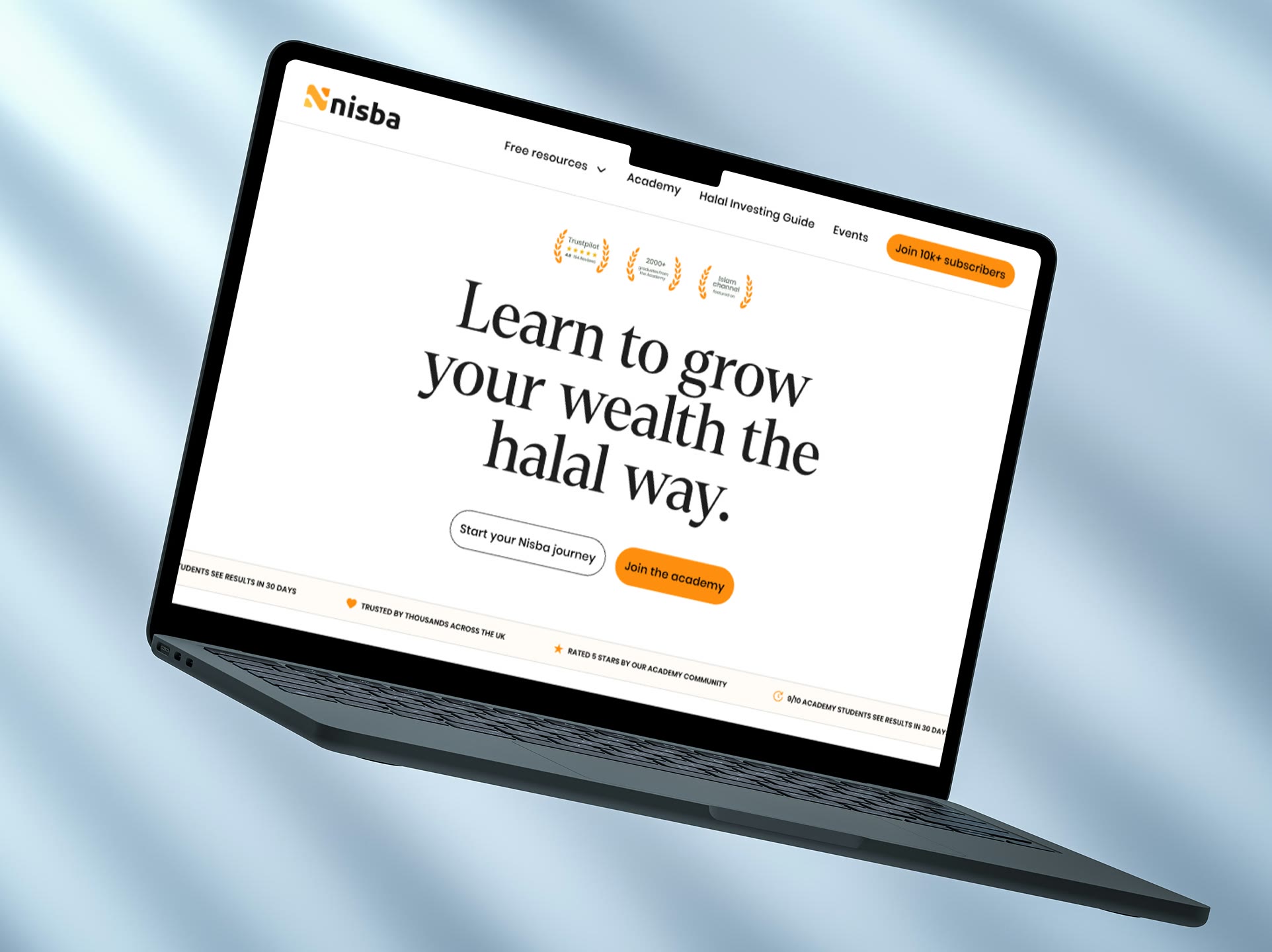
Nisba teaches Muslims the fundamentals of halal investing. It had grown well for years, then stalled, and the founders came to me to get revenue moving again. I rebuilt the brand and website around who their customers really were, and Academy sign-ups rose 57%.
- Role
- Design Director
- Worked with
- Nisba's founders and development team
- Timeline
- 4 months
- Scope
- Brand direction, brand design, research, website
Before
A business that had stalled, with a brand less credible than its founders.
After
A brand built to earn trust, a record course cohort, and Academy sign-ups up 57%.
57%
More Academy sign-ups, from the purchase flow alone
24%
Increase in revenue
+54
NPS, with satisfaction at 8.5 out of 10
10,000+
Subscribers surveyed, the company's first ever survey
01 — The problem
A brand that didn't match its founders
Nisba had more than 10,000 email subscribers and thousands of website visitors every week. Only a tiny share became paying customers.
The founders had built the brand themselves. It felt junior and scrappy, and said nothing of two people with deep backgrounds in corporate banking. For a platform asking people to trust it with their money, that was costing sales.
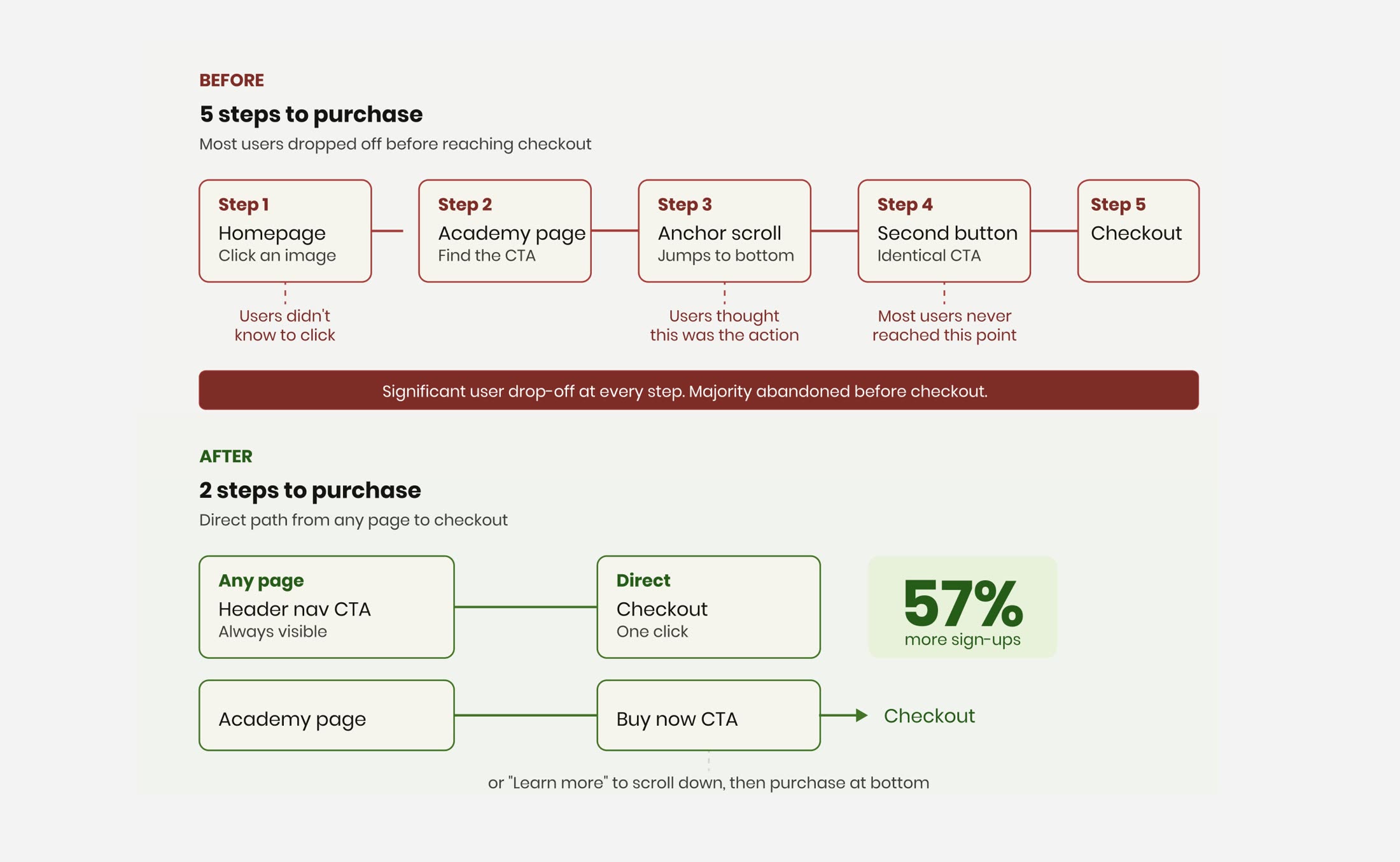
The website made it worse. Every product fought for attention, and reaching the Academy checkout took five steps, one of them a button that only scrolled the page.
02 — Discovery
Finding out who the customer really is
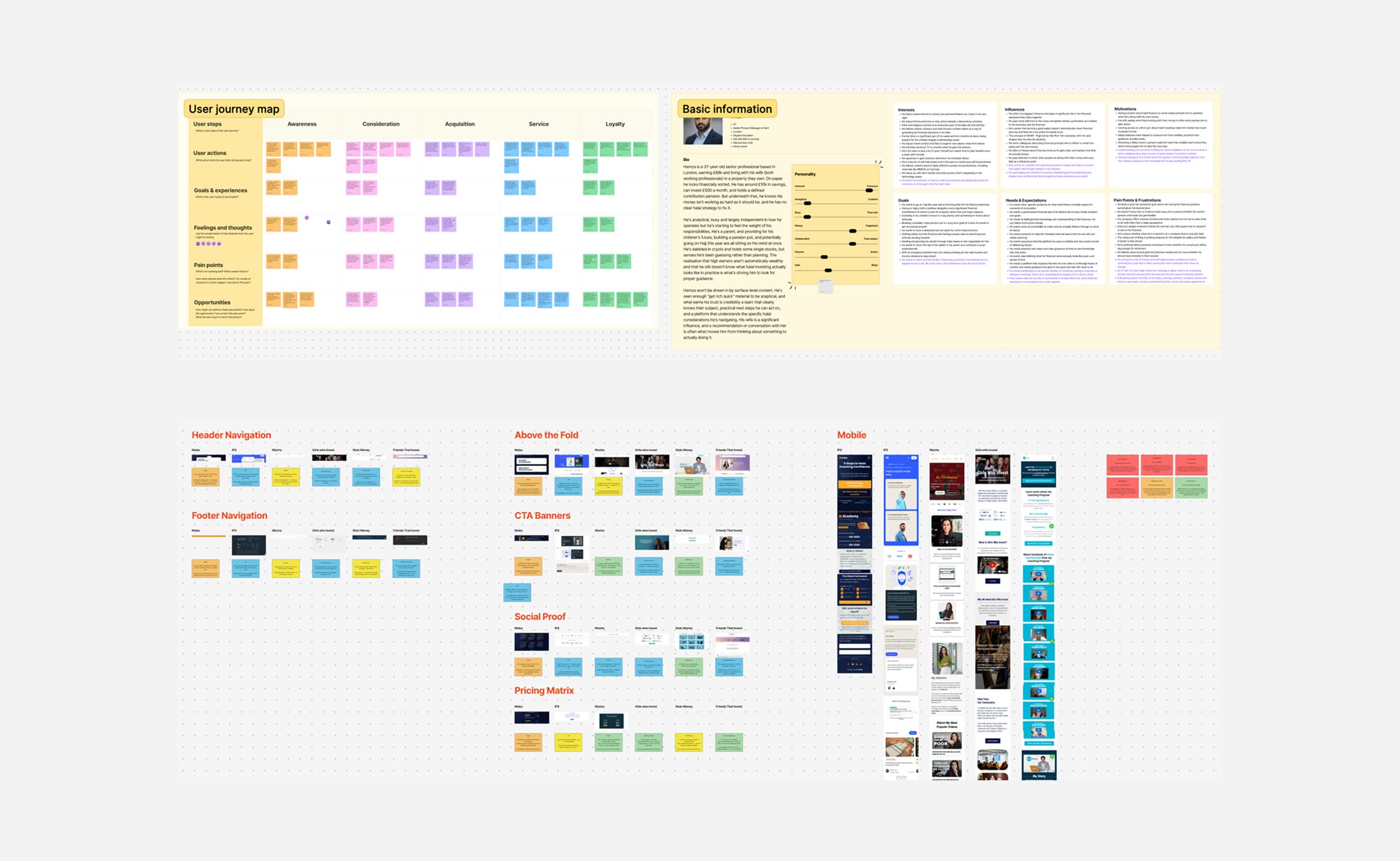
I began with the founders: their vision, how they had got here, what success would look like. Then came a full audit of the site, a competitor audit, persona workshops and a survey of all 10,000 subscribers.
The first paid workshop paid for itself. Out of that session, I helped them land their best cohort yet for the Islamic finance course, a record for the business.
The product wasn't the problem. People who engaged with Nisba rated it highly. The brand and website were failing to turn interest into trust, and trust into a purchase.
- 01
A trust gap
The brand didn't look credible enough for a finance platform.
- 02
A different audience
The founders had pictured men, or couples deciding together. Often it is the woman who decides, and who sends her husband reels about Islamic finance.
- 03
Events convert
76% of paying customers had attended an in-person event first.
03 — Brand direction
Three routes, one future
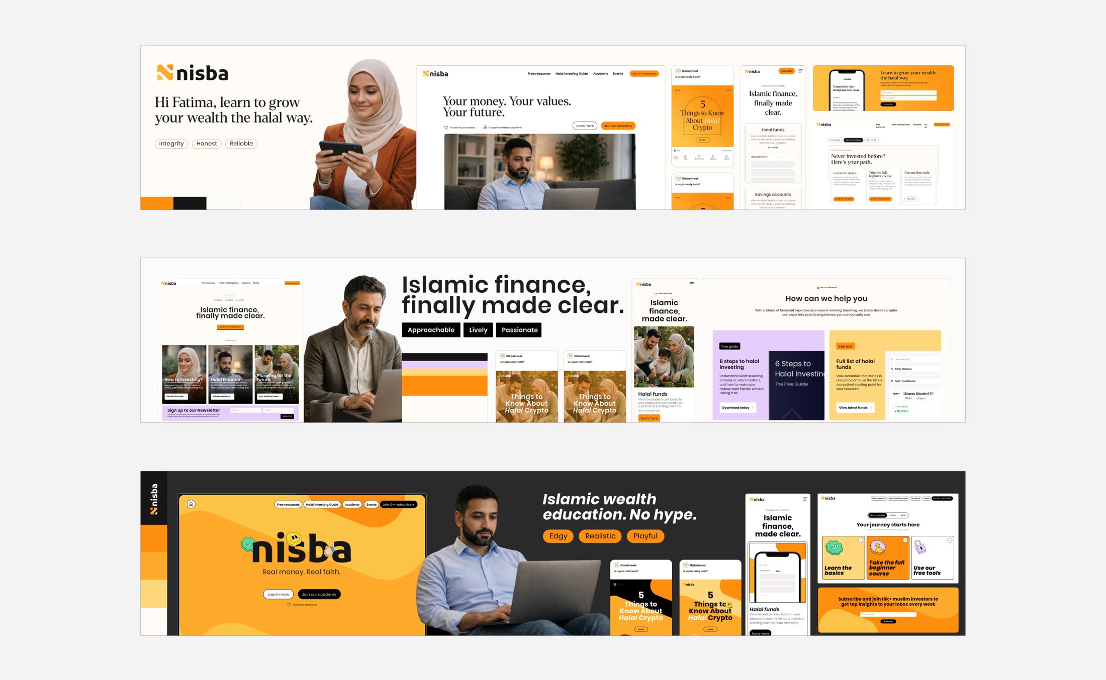
I explored the brand through stylescapes. The founders shared sites they admired, and I mapped those against competitors and the existing brand to see the gap.
Three routes came out of it. Integrity, built on trust and institutional credibility. Approachable, warmer and more lively. Edgy, playful and close to Nisba's strong TikTok presence.
04 — The decision
Designing for the dream customer
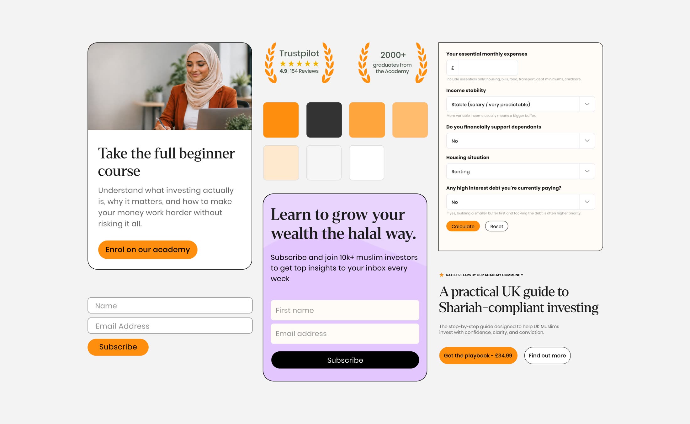
The founders chose Integrity, with some of the warmth of the Approachable route blended in.
What decided it was the future. In the persona workshops I had mapped three customers: the current one, the target one and the dream one. Nisba's long-term aim is to act as a halal brokerage, and that customer has more wealth and expects the credibility of a financial institution.
The playful energy could live in social content. The core brand had to earn trust at a higher level.
05 — The website
Trust first, then a short path to buying
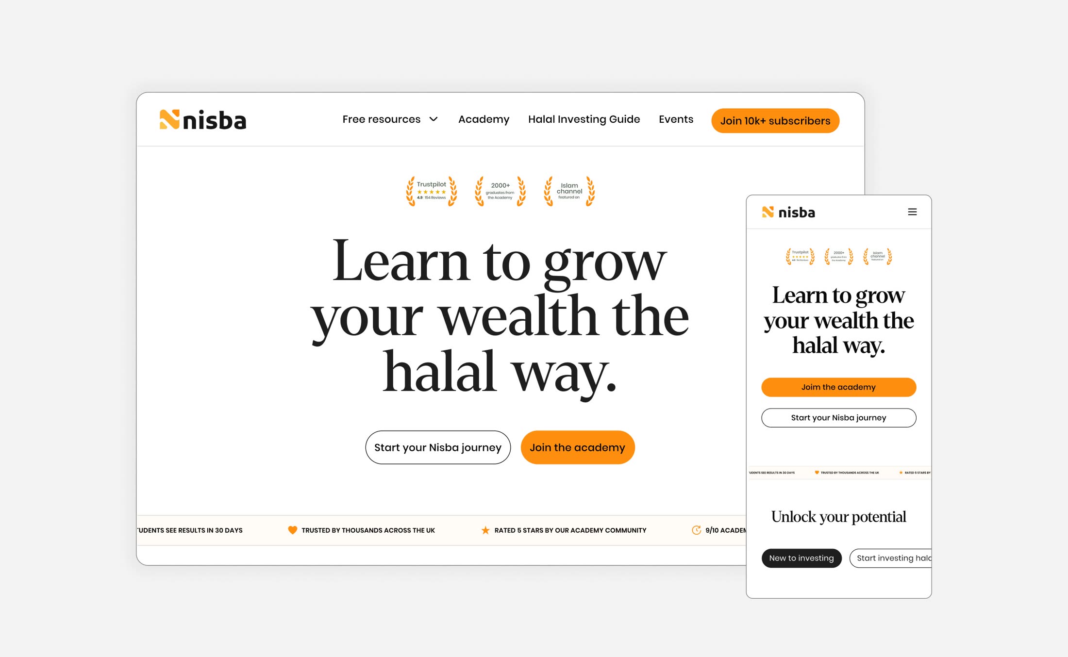
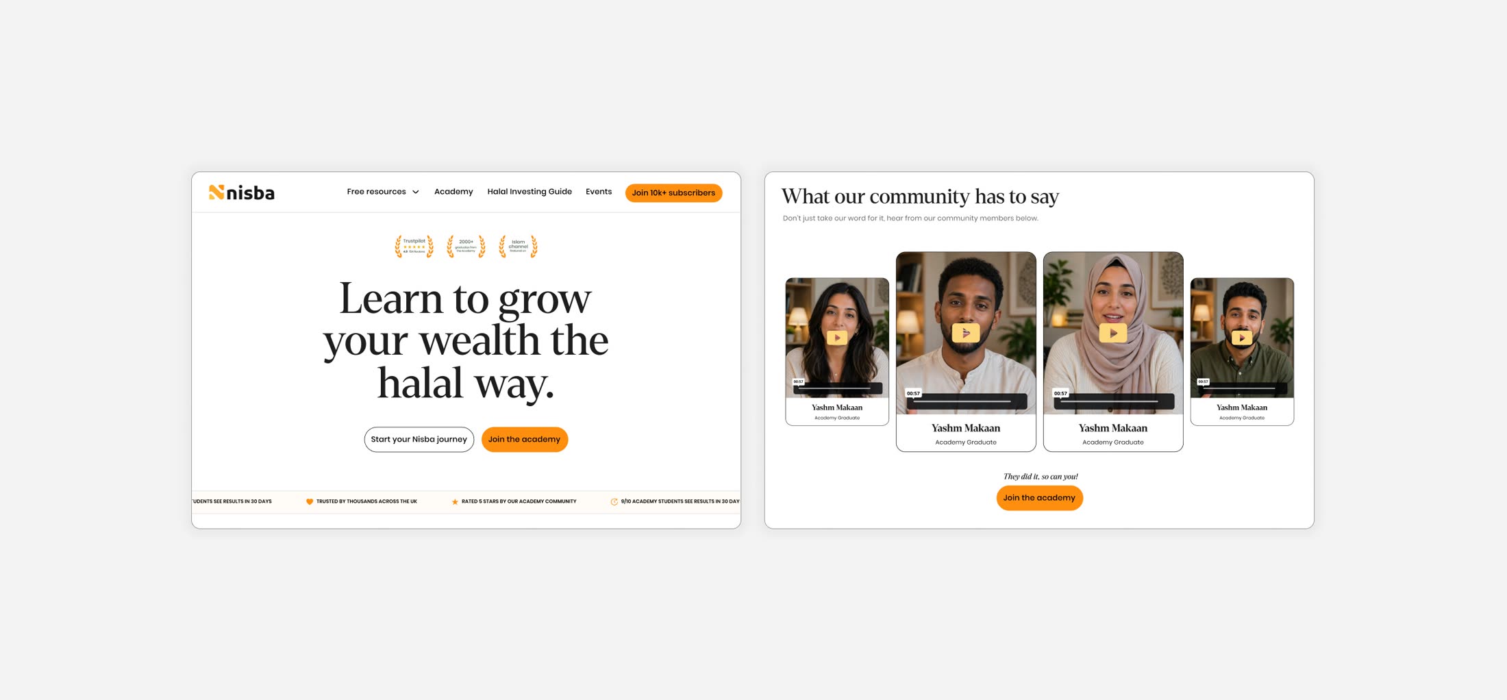
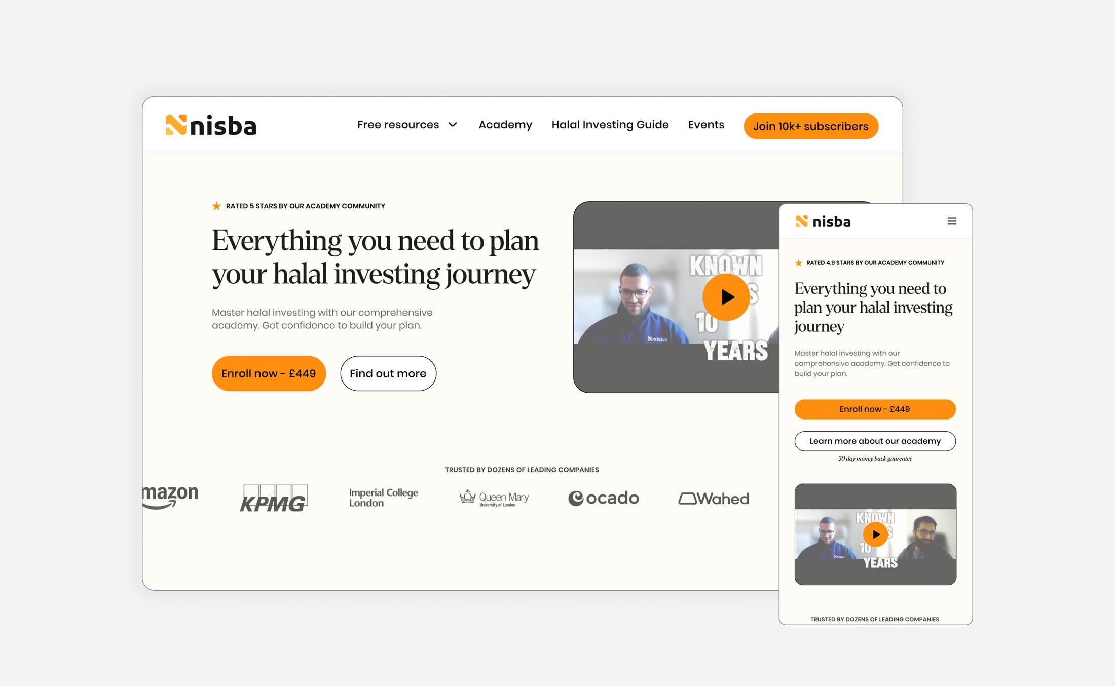
The old site had no social proof at all. I added it throughout: student numbers, testimonials, founder credentials and community size. Every page that asks for a purchase gives a reason to believe first.
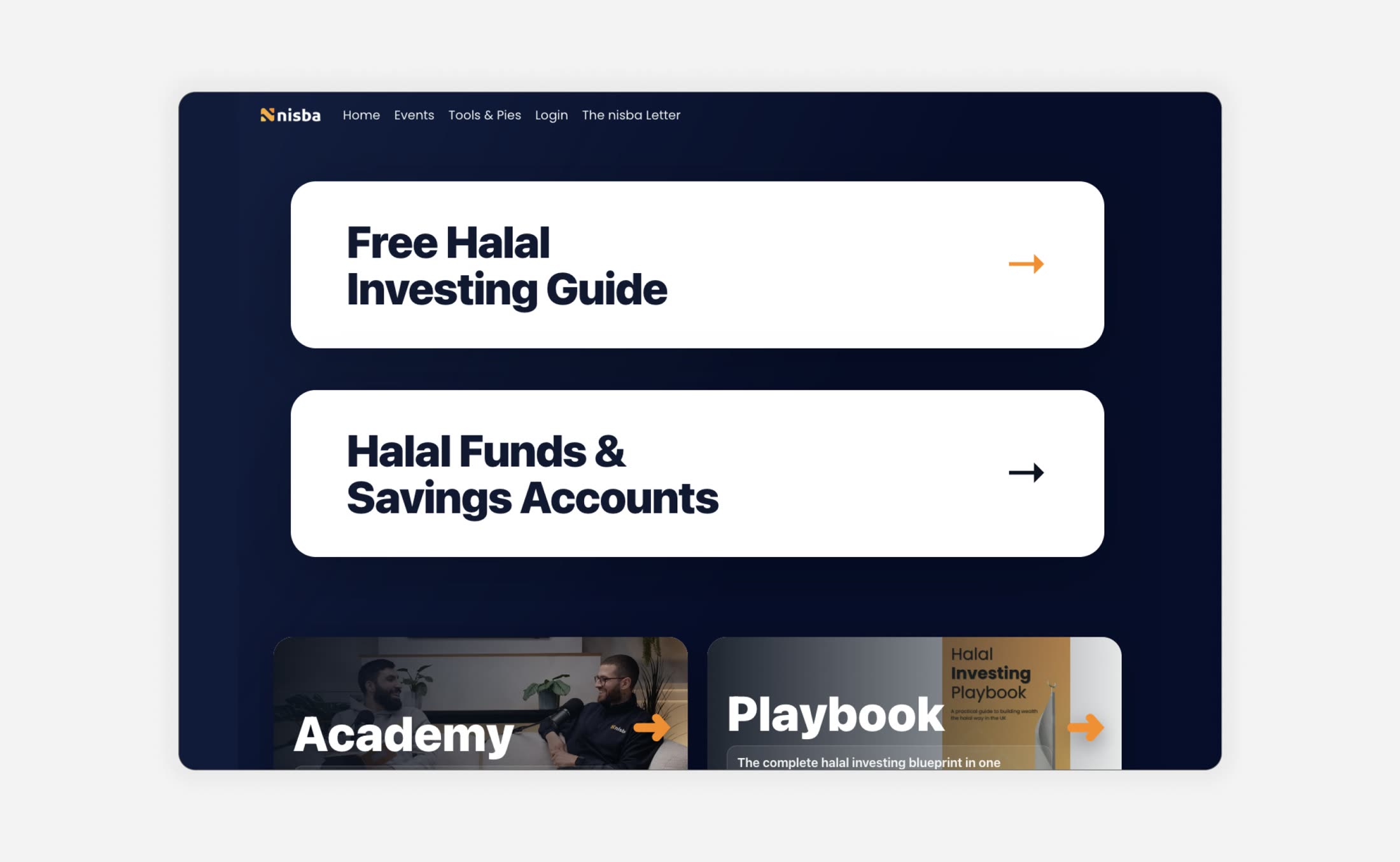
Then I cleared the route. The Academy went into the main navigation with a button in the header, and each sales page opens with two choices: buy now or learn more. Five steps to purchase became two.
06 — The system
Built for what comes next
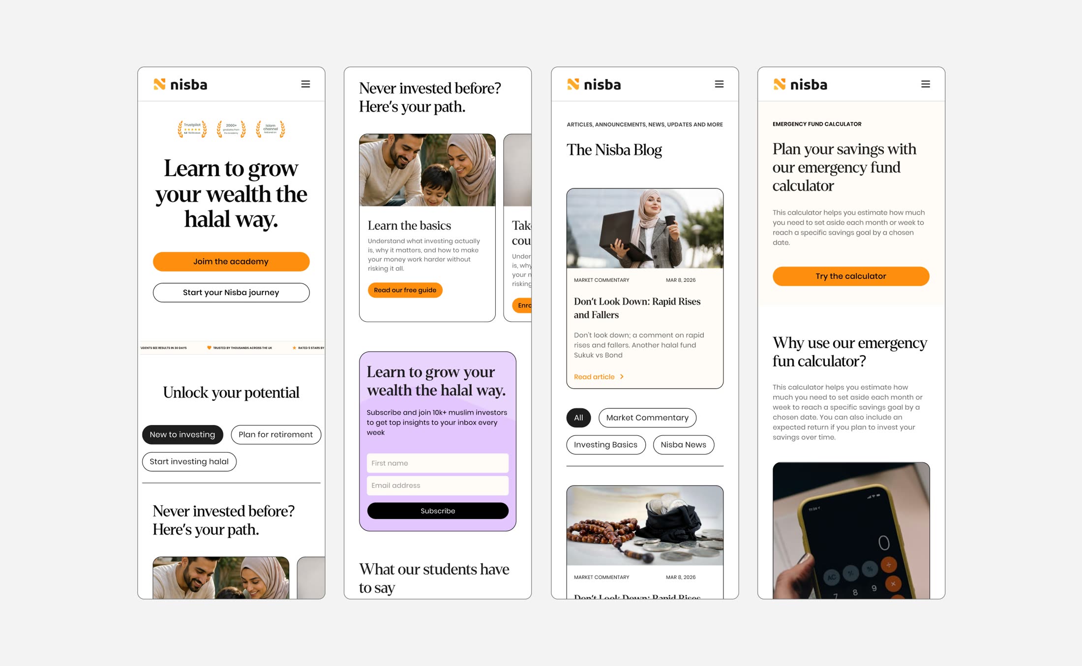
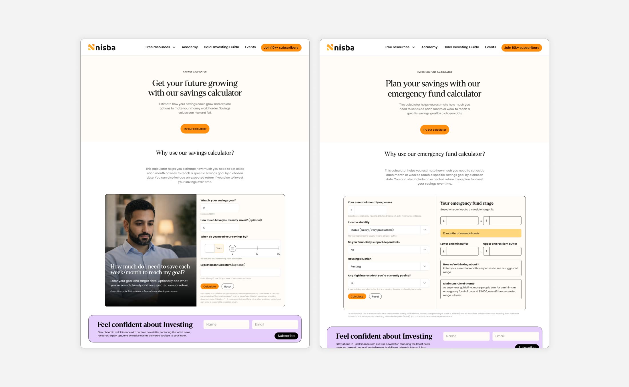
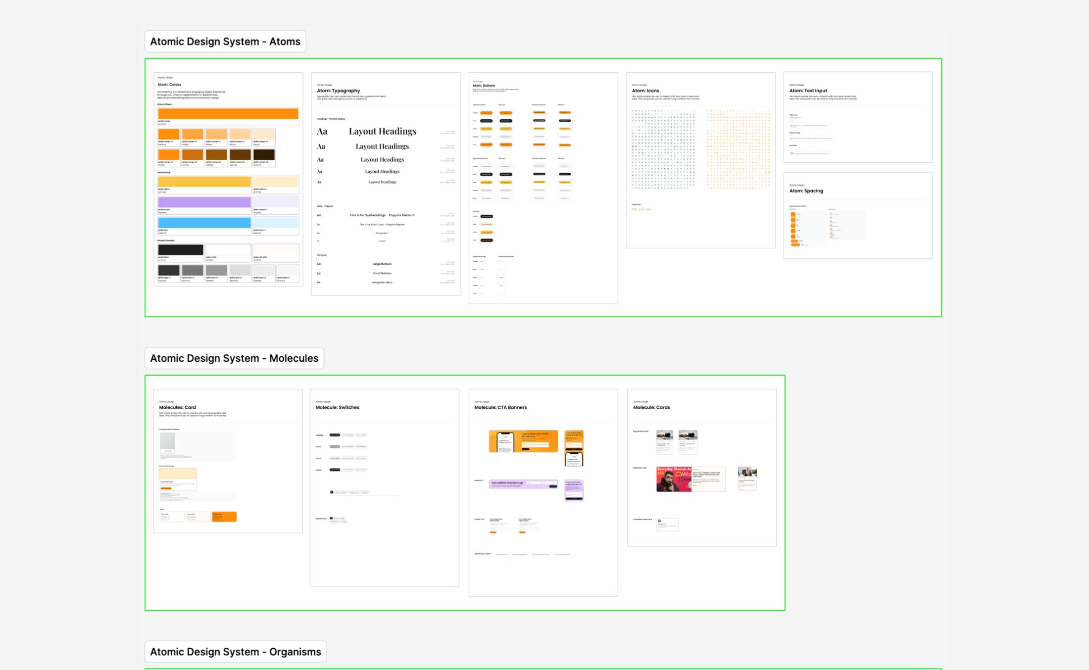
The design system was made with future products in mind, starting with the Halal Screener that was already on the roadmap. Colour, type, buttons and components work across marketing pages, product interfaces and event materials.
Serif type stays for editorial and marketing, where warmth matters. Product interfaces are sans-serif throughout.
Outcome
The streamlined purchase flow alone lifted Academy sign-ups by 57%, Nisba's best sales performance ever, and the research changed how the business goes to market.